ROLES
- Working in close collaboration with a Senior Developer, I assumed the following roles:
- Digital Strategist
- Web Designer
- UX Designer
DELIVERABLES
- High-fidelity mock-up
- Wireframe
- Sitemap
- Personas
- Competitive analysis
SPECIFICATIONS
- Duration:
- 4 weeks of web design
- 2 weeks of web-development support
- Tools:
- Figma
- Photoshop
- Google docs
Overview
The Harmony Aikido Foundation (HAF) engaged me to craft their digital strategy and design their website. I refined their message architecture and structured their content, which served as the starting point to design a responsive identity site that positions HAF for the future.
I worked closely with seasoned developer Daniel James to design and ship this responsive website within a tight design and web development timeline of six weeks.
VIEW THE LIVE RESPONSIVE WEBSITEA responsive website for the Harmony Aikido Foundation
This is a story about how a website design effort became the catalyst for a nonprofit organization to crystalize their future goals and objectives.
Objectives
How the project got started
When my friend Chelsea shared that the Harmony Aikido Foundation is in need of a new website to solidify their digital identity, I immediately volunteered.
Harmony Aikido Foundation (HAF) is a nonprofit organization that partners with local community groups to provide high-quality self-defense and awareness training for community members of all ages. Here is a video showcasing their campaign to equip 1,000 women with self-defense training:
From web designer to digital strategist
“What would you like to accomplish with this new website? And what are you prepared to offer to the public once this launches?”
Asking the two questions above transformed a routine requirements-gathering effort into a goal-alignment process among HAF's core leadership team. Here is a diagram of our communication lines:
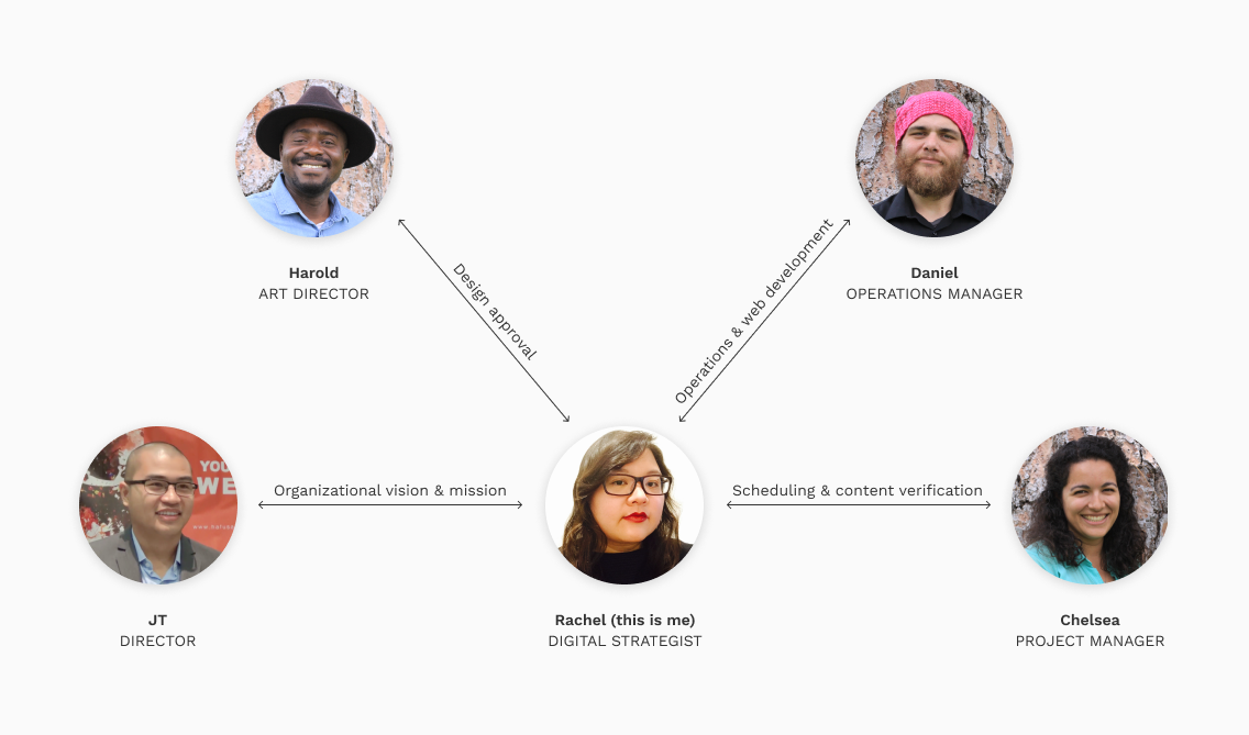
My role quickly grew from Web Designer to that of a Digital Strategist. I took the time to conduct one-on-one interviews with each stakeholder. I found this interview format to be more conducive in getting a stakeholder to speak more openly about the hurdles they face in reaching their goals, which naturally led to discussions on how the website can alleviate some of those hurdles.
I also learned that I can lean on the depth of each stakeholder's specialized knowledge to complement the wide breadth of my personal knowledge that spans multiple areas.
Key objectives
After several in-person meetings, phone calls, and video conferences with key stakeholders, we came up with the following primary goals for the site:
Goal 1
A digital identity
The site will convey Harmony Aikido Foundation (HAF)'s vision, mission, and impact to the general public as well as to the four main groups that HAF interacts with: public officials, program coordinators, parents of participants, and the participants themselves.
Goal 2
A hub for communications
The site will consolidate all HAF-related information in one digital repository. It will act as a centralized hub that collects traffic from various social media platforms.
Goal 3
A digital campaign extension
The site will serve to extend HAF’s campaign efforts to the digital space. The Resources section is projected to play a key part in building an online following for HAF, as well as for future media fundraising campaigns.
Research
Who are we designing for?
After speaking to the HAF’s Project Manager and Operations Manager, we determined that our primary audience comprise of four groups: the public officials, program coordinators, parents of participants, and the class participants themselves.
Here are the four personas that represent each group:
Competitive analysis
I looked to several key players in the nonprofit space to study how organizations position themselves in the digital space.
Impact Bay Area of San Francisco and Guardian Gym of Oakland stood out for their focus on empowering individuals to protect communities. I analyzed the way each one communicates their identities through their websites.
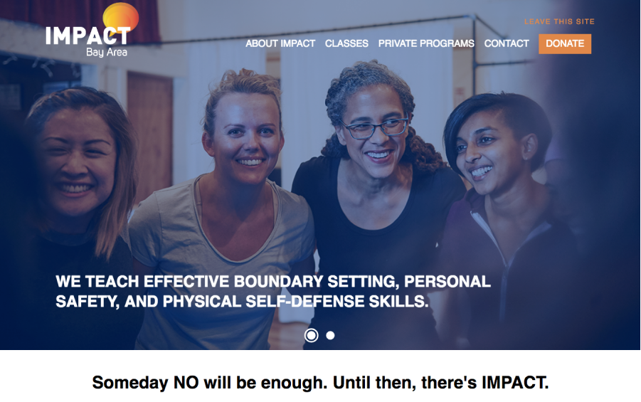
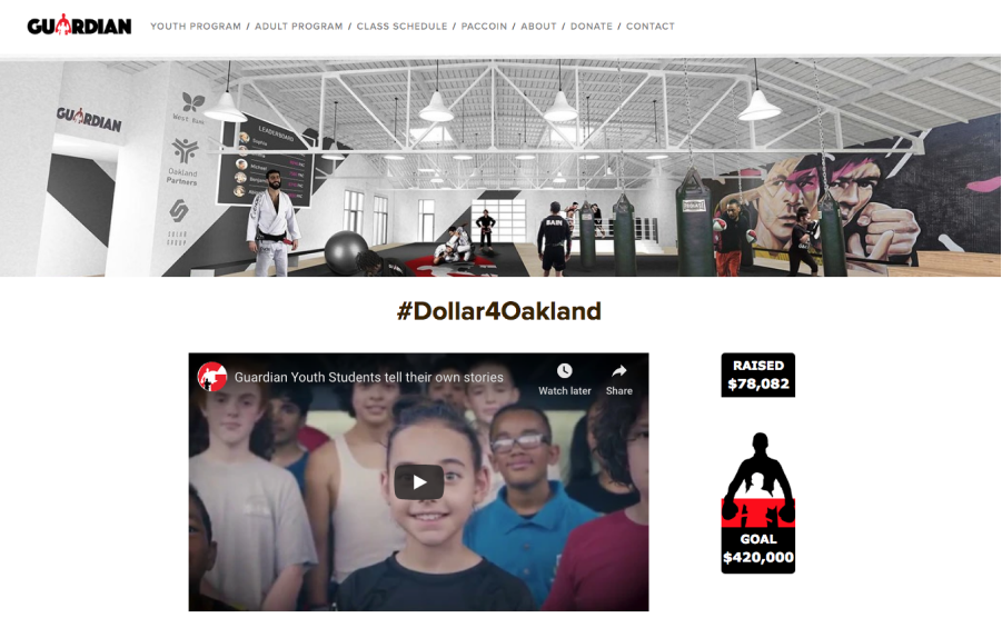
Both Impact Bay Area and Guardian Gym chose imagery that highlight their impact on the community. This is a very different approach than the traditional focus on martial arts pedigrees that are prevalent in self-defense sites.
However, a key weakness on both websites is in the way they both present dense factual information in blocks of texts that are inconsistently sized and spaced. Both sites would also benefit from more consistency in photography art direction and image-sizing.
I looked to other nonprofit organizations such as Upstream International and International Justice Mission (IJM) for web design inspiration.
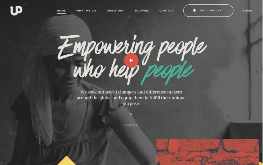
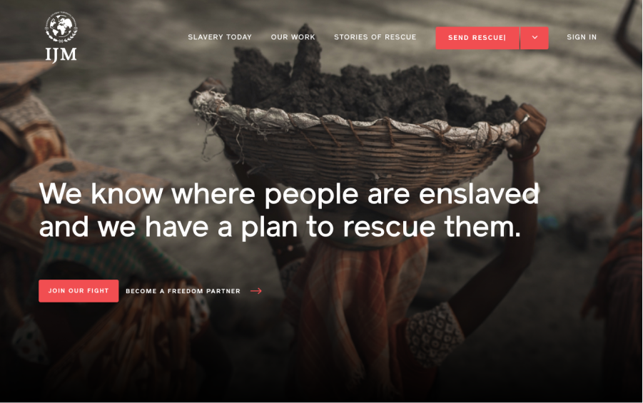
Both Upstream and IJM adopt a long and linear landing page layout with a navigation bar that reappears when the user scrolls upwards.
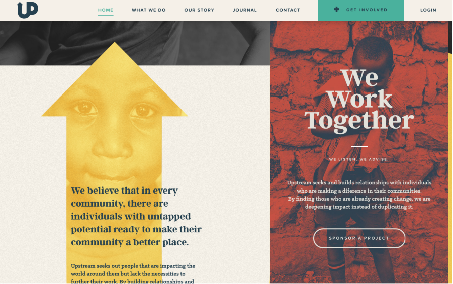
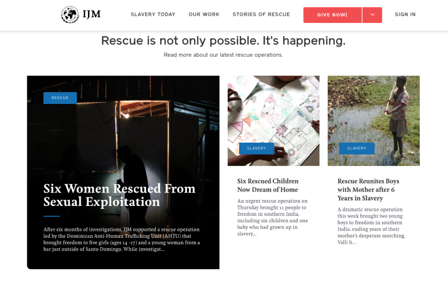
Upstream's use of color and imagery to tell their story is very effective and visually compelling. However, at times it was hampering the legibility of their content.
IJM does a great job in organizing dense information into readable chunks supported by imagery. The cleanliness of their navigation bar (at only six top-level menu items) is impressive for a nonprofit of their scale.
Structure
I began to define the functionality, content, and site navigation through page-level wireframes and site-maps.
Sitemap
I was able to narrow down the scope of the website design effort and convey it in this preliminary sitemap. I made every effort to make sure that a piece of information is never more than three levels deep.

Wireframe structure
Initially, we considered a carousel of images to grace the hero portion of the page. However we did not want to risk users being unable to discover information because they did not stay long enough for the hero content to auto-advance. At this stage, we knew that we would be implementing a fixed top navigation bar due to the long and linear nature of our landing page.
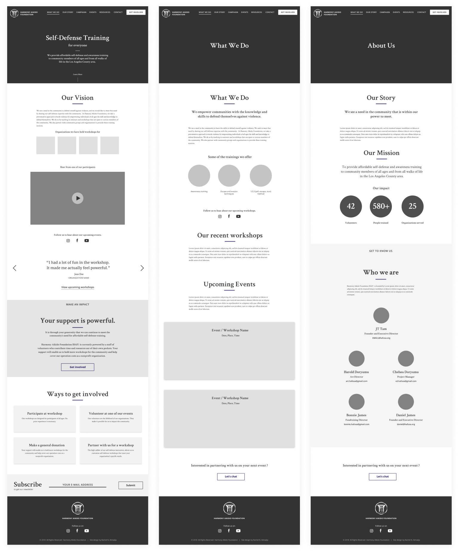
To increase discoverability and facilitate better stortytelling, I opted to go with a long and linear page layout that succinctly narrates Harmony Aikido Foundation’s background, story, and impact using just the right amount of text and plenty of imagery.
Design Studies
Selecting an art direction
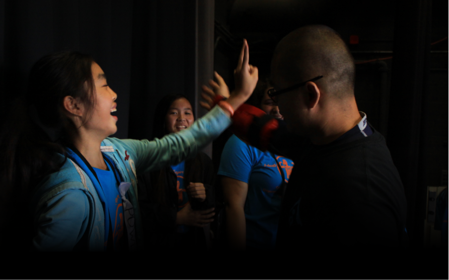
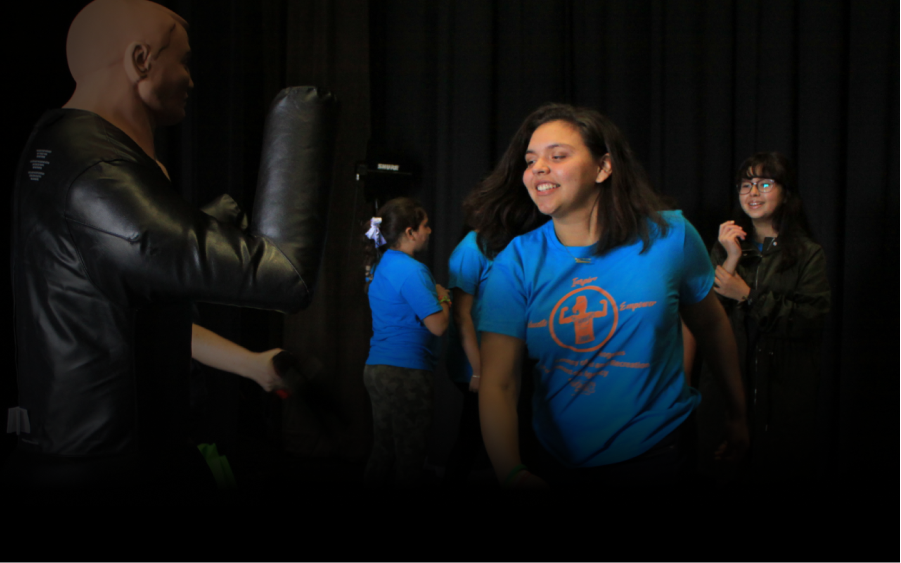
HAF's focus on protecting communities through empowering individuals led to an art direction that focuses on capturing real-life workshop participants through great photography.
Fortunately, HAF has a talented photographer who happens to be their Project Manager—Chelsea Doryumu. She captured the image of actual participants sparring at HAF community events. Her photographs perfectly captures the essence of HAF as an organization and became the hero feature of each page.
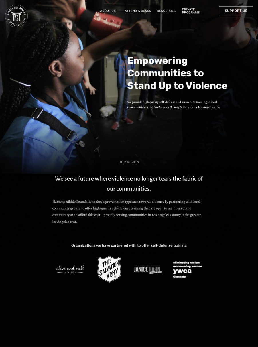
Hero studies
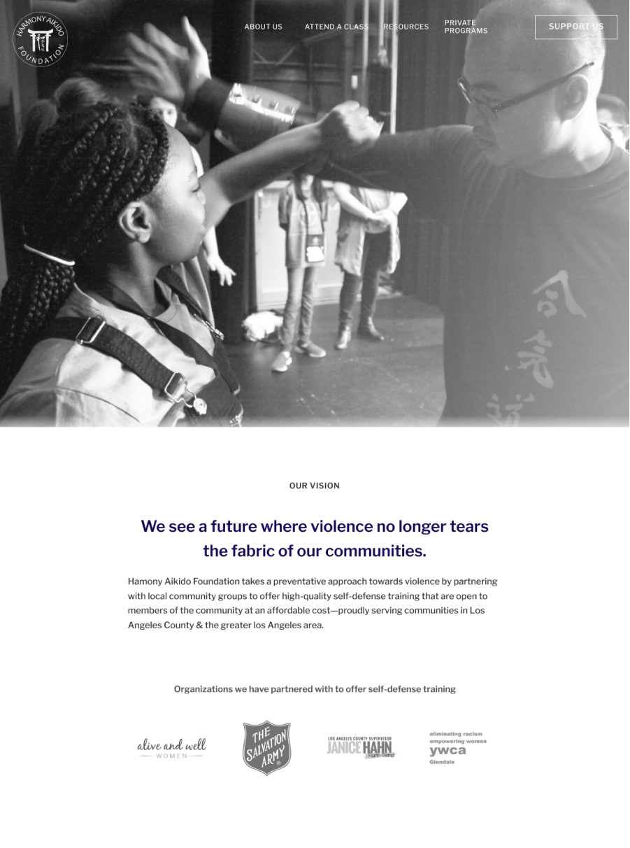
With Chelsea's beautiful photography for a primary art direction, I proceeded to create several iterations of the hero feature layout.
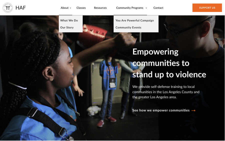
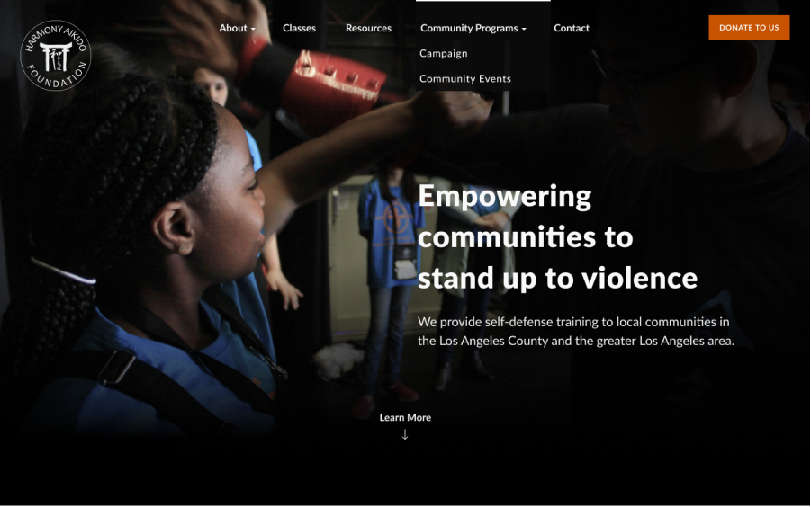
Navigation studies
The long and linear layout of our pages necessitates a fixed navigation bar. Here are a few color scheme studies for the navigation bar.
Design iterations and preference tests
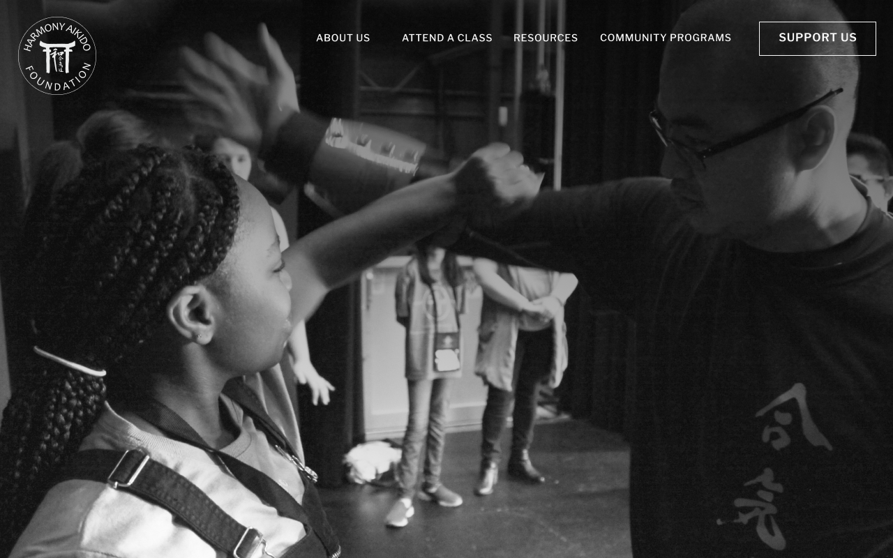
Hero image
“Which of these image options does a better job in evoking a sense of empowered strength and pulling you into a story?”
15%
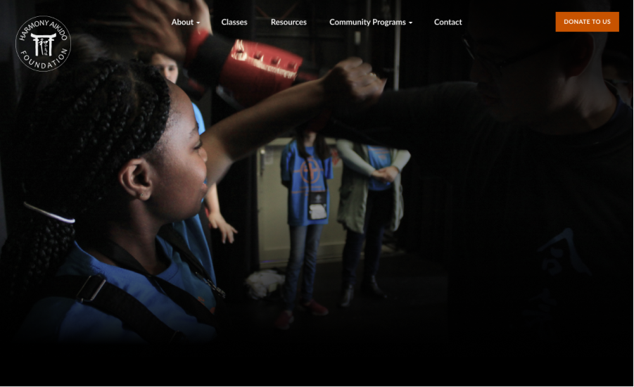
85%
Community events feed
“Which of these two events feed layout is more informative?”
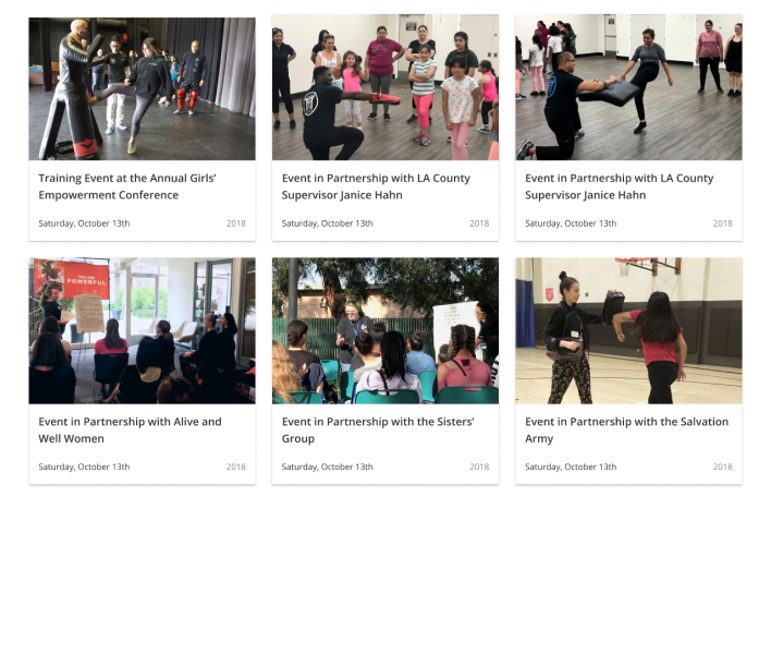
40%
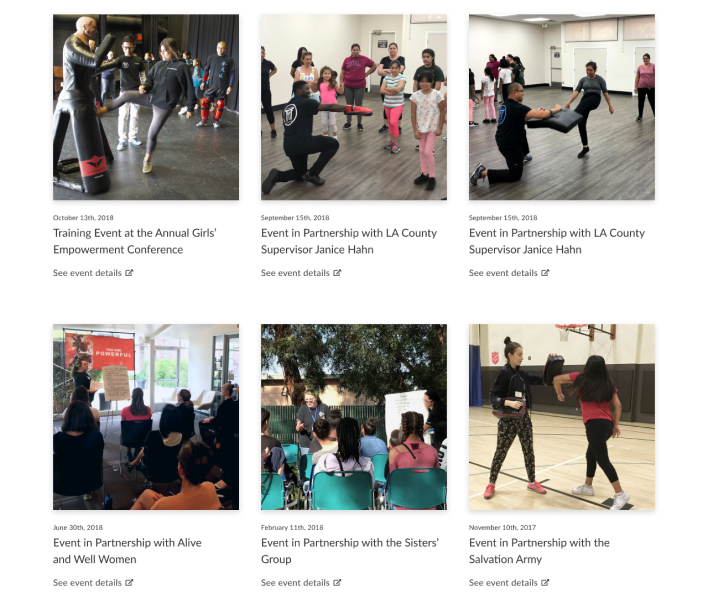
60%
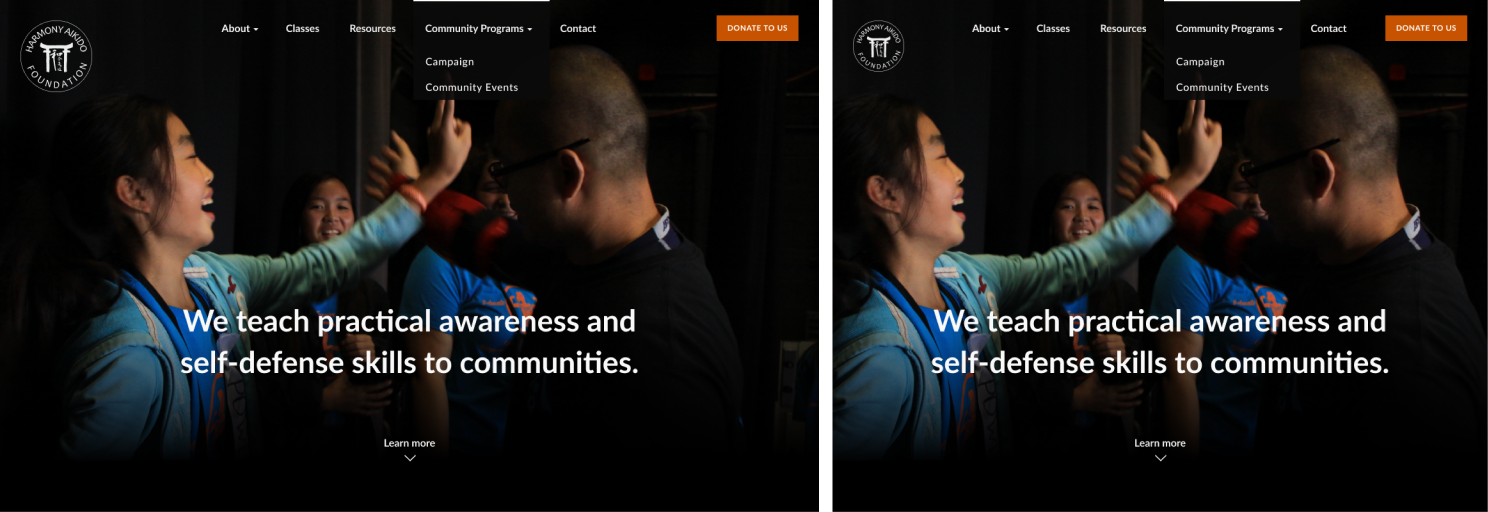
Responsive strategy
We wanted the focus to be on the featured photography. Since the focal points tend to be towards the center of the image, we aligned the hero text closer towards the bottom of the hero image.

Final Design
Typography

Crimson Text with its generous x-height is chosen for the body text. For its ability to complement the geometry of Crimson Text, the typeface Lato is chosen for headers. It also has enough warmth and personality to work as a display face.
Style Tiles
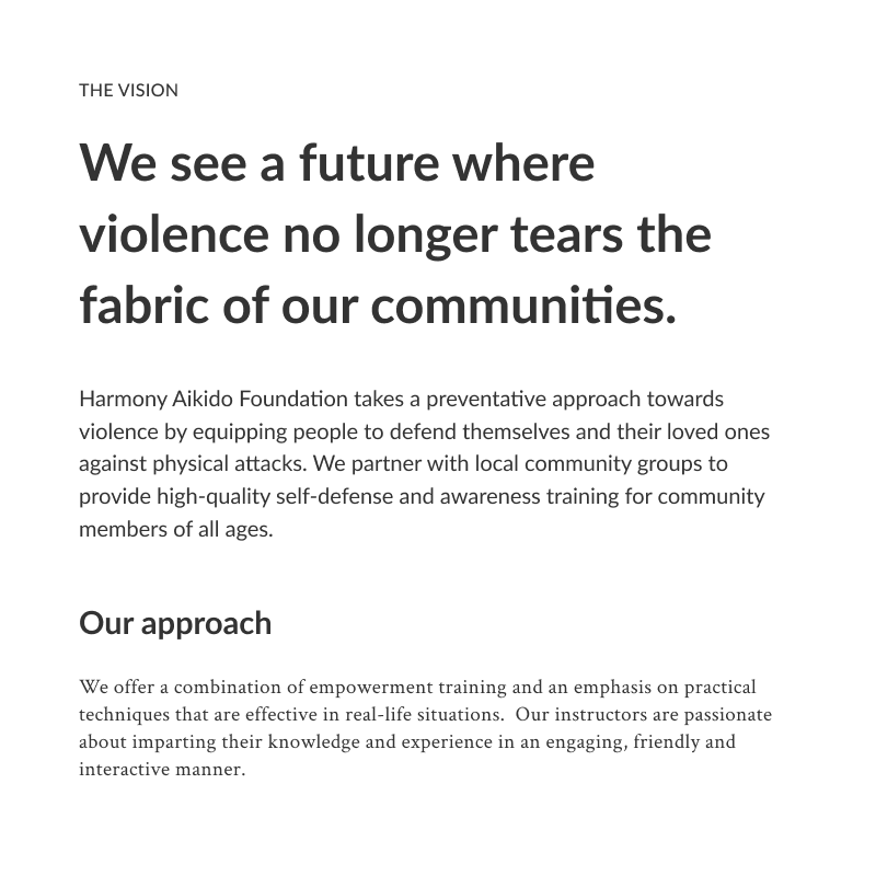
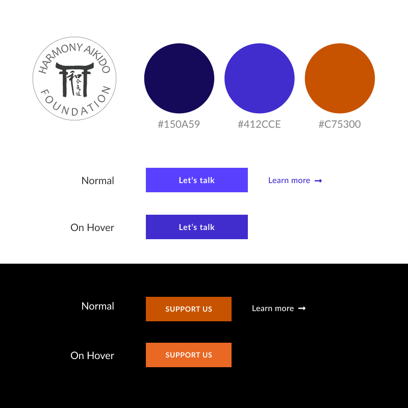
A complementary color scheme of blue and orange suits the project requirement of a bright hue for dark backgrounds, and a dark and more saturated hue to stand out against the white background.
Putting it all together
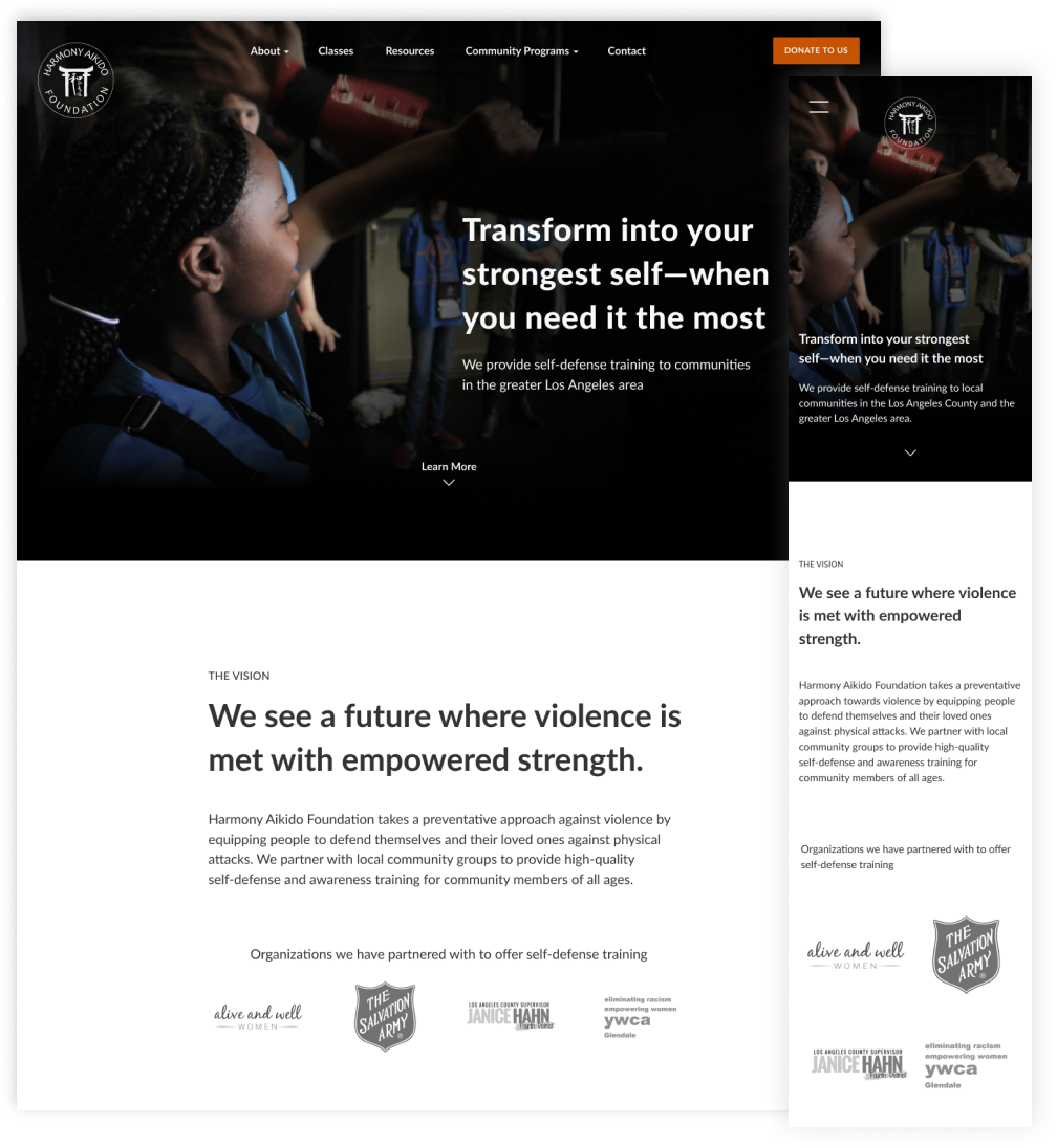
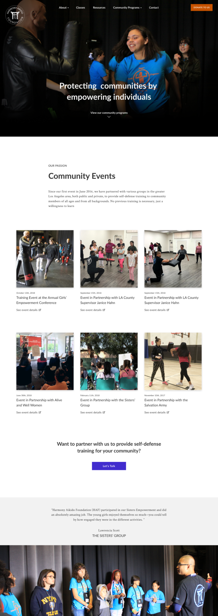
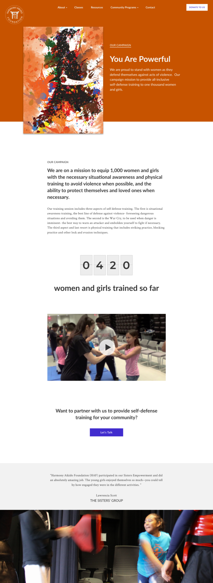
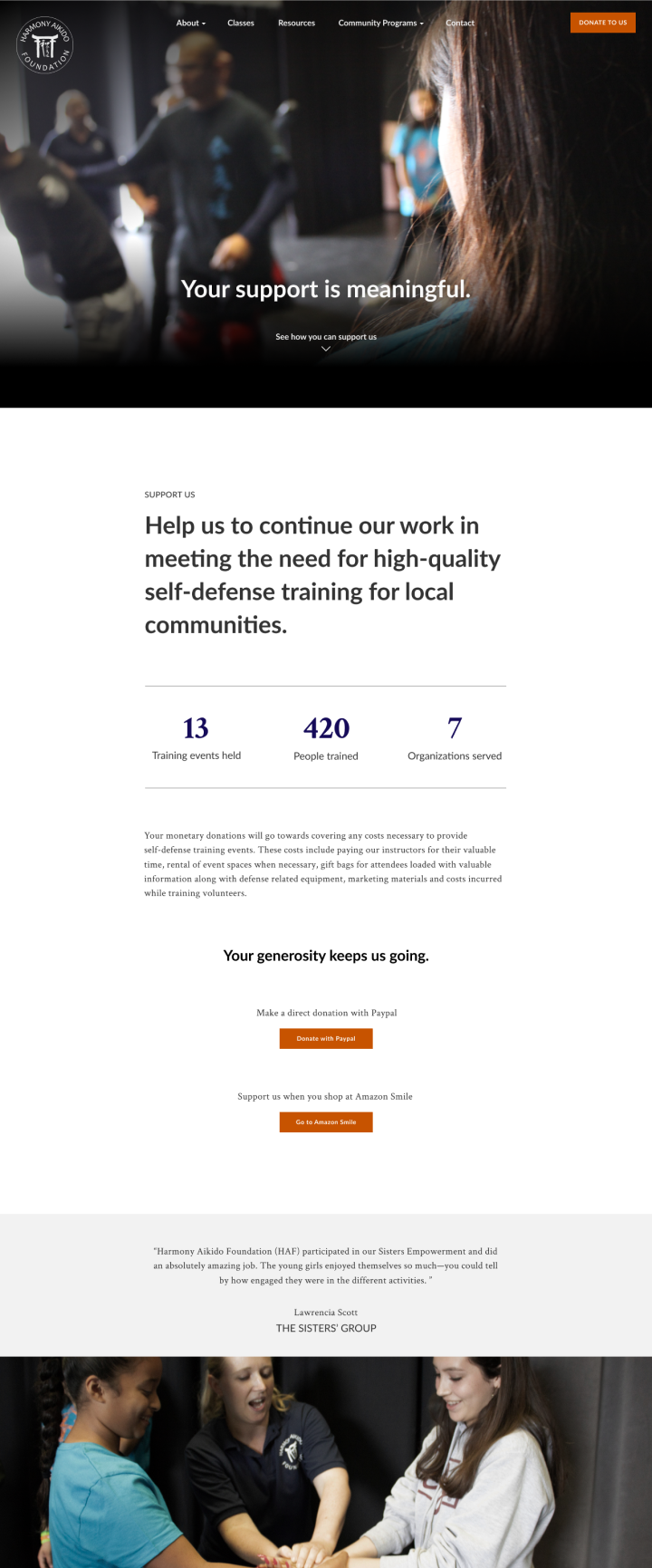
A tight deadline of 6 weeks and a very lean team led me to create a center-aligned page layout that takes advantage of interchangeable page components. In the end, this tight constraint led to a design that is very consistent in structure, but offers flexibility in arranging content. Below are the high-fidelity mock-ups of the final website design.
VIEW THE LIVE RESPONSIVE WEBSITEThe Harmony Aikido Foundation website is designed by myself & developed by Daniel James

