ROLES
- This is a solo project where I assumed the following roles:
- UX Strategist
- UX Designer
- Web Designer
DELIVERABLES
- UX Design & Strategy:
- MVP scope
- User stories and persona
- Competitive analysis
- User research analysis
- Web Design:
- High-fidelity mockups
- Wireframe
- Competitive analysis
SPECIFICATIONS
- Duration:
- 4 weeks
- Tools:
- Figma
- Iterate HQ for surveys
- Axure RP for user flows
- Google docs
Overview
Ingrain is a plant-based, meal-planning app that is conceived as a response to the diabetes epidemic that is presently ravaging North America. Its purpose is to equip people who suffer from diabetes (and other chronic diseases) to reverse their diagnosis with plant-based foods.
In an effort to decrease the barriers to healthy-eating, Ingrain provides the nutritional information and tools that people need in order to plan, prep, and cook plant-based recipes.
To further encourage the formation of healthy eating habits, Ingrain will curate recipe suggestions that are prioritized based on how closely they match a user's cuisine preferences. Additionally, users will be able to track their daily progress through an interactive food tracker.
A case study in two parts
This is Part 1 of 2 in the Ingrain case study series. This first part covers the research and user insights that led me to redefine the MVP. The same insights became the basis for structuring the content of a product page to maximize user engagement.
See the process of putting usability ahead of expressivity in Part 2: User Interface and Interaction Design
Ingrain Part 1: UX Strategy & Product Page Design
I learned to let go of my notions of what a product should be—and allow research data and user insights to guide me to what the product needs to become.
Research
Why address a diabetes epidemic with a meal planning app?
The problem with a traditional approach to treating diabetes is that it undervalues the role of plant-based foods as natural medicine to heal the body.
Diabetes treatment regiments tend to focus on managing the disease through medication. The goal is to prolong life expectancy with diabetes rather than eradicating it completely. The design of apps for diabetic persons have mirrored this approach by focusing on providing disease-management tools such as logbook apps that monitor blood sugar levels.
From the start, Ingrain is about healing the body with plant-based foods.


Rather than simply providing the tools to manage a disease, Ingrain provides the tools for anyone to transition into plant-based eating and reverse the progression of chronic diseases like diabetes.
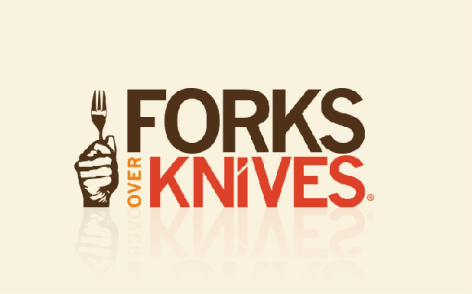
Ingrain’s plant-based approach builds upon the research done by American physicians Dr. Rip Esselstyn and Dr. Neal Barnard, as featured on the documentary film Forks over Knives.
The first pivot


Although Ingrain grew to become a plant-based meal-planning app, it didn’t start out that way. Originally, I set out to design a gamified nutrition education app for youths that are at-risk for diabetes. I focused on the age range between 9 to 14 because my research had shown that most youths who develop diabetes will be diagnosed with the disease along this age range.
However, given the time constraint of 8 weeks for the project, waiting two weeks to receive signed permissions to conduct user testing on minors was not an option. And so I shifted my target audience under the hypothesis that a gamified nutrition education would be effective in getting young adults to make better food choices for their health.
View the full target user group selection analysisValidating assumptions of the users' mental models
I conducted user research to better understand the mental model of young adults when it comes to healthy-eating. To validate the assumptions of users’ mental models that I gleaned through research, I deployed a survey and conducted interviews to assess young adults' perceptions and attitudes towards the relationship between food and health.
The following are the risky assumptions that need to be validated:
Pain Points


Goals and Motivations


Mindset


After reviewing 27 survey responses and analyzing 3 interview responses, I identified patterns that I distilled into the following shared characteristics of my target user base:
Mindset
Widespread confusion over which foods are actually healthy.
When participants were asked to rank 12 foods in the order of most to least healthy, the top 3 spots are taken by plant-based foods. But the belief that fish and chicken are healthier meats compared to beef still persists.
Pain point
High smoker mentality of eating what they know to be unhealthy foods.
44% indicate eating something they know is unhealthy at least once a day.
78% consider meals containing meat and carbs as foods to reward themselves with.
Motivation
High reward-seeking behaviors and low accountability-seeking behavior.
Several participants believe that exercising regularly cancels out the negative impact of consuming high-fat foods.
Rampant misconception that chronic diseases like diabetes and high cholesterol are hereditary diseases rather than the result of a diet high in animal products and processed foods.
View the user survey created on Iterate HQThe second pivot


After analyzing the survey and interview responses, I learned that the biggest barrier to healthy eating was not a lack of nutrition education, or a lack of money. Patterns in the data I gathered led me to conclude that the biggest barrier to healthy eating was actually apathy. Namely, apathy about how one's food choices affect one's health five years down the road.
I realized then that no amount of gamified nutrition education will convince those who are apathetic to their health—that their poor dietary choices are on a collision course with their health.
This insight led me to shift Ingrain’s target user group. Instead of trying to convince unmotivated adults to eat healthily through a gamified nutrition education app, Ingrain will instead empower those who have made the decision to transition into plant-based foods by empowering them with the tools they need to succeed.
View the full user research analysisAnalyzing the competition
I studied several competitors to understand how they position themselves in the marketplace and discern their business models.
Model 1—The vertically-integrated meal-delivery kit providers
ChooseVeg Meal Planner and the Jay-Z & Beyonce-endorsed 22 Days of Nutrition act as extensions of a vertically-integrated meal-delivery service. Consequently, their meal-planning services are geared towards selling their food products.
Model 2—The traffic funnels
The second model is that of meal-planning apps that function as traffic funnels that direct users towards a brand’s website. Their business model is geared towards enticing customers who can afford to buy their services and merchandise—by offering access to a limited version of their services.
Model 3—The community recipe site
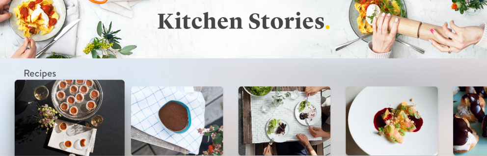
A third model focuses on serving as many users as possible by providing them with free access to curated recipe content and monetizing through product-placement. The result is a crisp, user-focused cooking app that is not trying to sell products to users. The best example of this is the Berlin-based cooking app Kitchen Stories.
It became clear that Ingrain should follow the community-recipe-site model, with a plant-based perspective at its core.
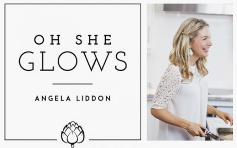
I then proceeded to take a closer look at the structure and interface of three recipe apps that best reflect the plant-based ethos in their interface. They are Kitchen Stories, Oh She Glows, and the Forks Over Knives Meal Planner app.
Here is a breakdown of what each app does best:
Kitchen Stories
Kitchen Stories has the cleanest and tightest information architecture that I have ever seen in recipe apps. This is accomplished by limiting user engagement with content (e.g. like, save, share) to the smallest unit of information (a recipe article). A featured kitchen story is never more than two levels deep.
Oh She Glows
Oh She Glows has the best consistency in art direction. It also has the most comprehensive search filters that take users’ lifestyles into account, such as filtering by dish type, meals, seasons, occasions, time-to-prep, and budget-limit.
Forks Over Knives
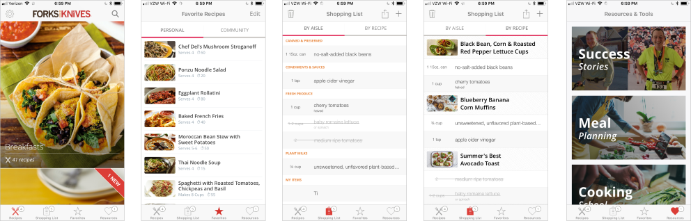
Like Kitchen Stories, the Forks meal planning app has a tight user flow where a stand-alone article is never more than two levels deep, which eliminates the need for back-buttons to have labels that indicate its destination. Its tab bar navigation is conducive to the multi-tasking required to meal plan.
View the full competitive analysisDefining the target audience
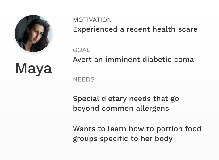
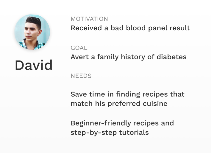
I distilled the findings from user research into two personas that have similar motivations, but differ in terms of gender, life stage, and level of cooking expertise.
Defining the MVP
Product design goals
During the course of user research and competitive analysis, the following high-level product design goals emerge:
Design Goal 1
Reduce or eliminate friction at every step towards the formation of healthy eating habits
Designing to promote behavioral change must extend beyond simply providing information. Supporting people on their journey towards health entails removing friction at every step, such as the planning, purchasing, and cooking of healthy foods.
Design Goal 2
Give clear, actionable information and provide a means to measure one's progress
The UI has to seamlessly transition users from meal-planning mode to meal-cooking mode. Additionally, providing a means to track one's progress towards a goal is critical in a habit-formation app. In the words of Scott Belsky, "one has to feel progress in order to make more progress."
User stories prioritization
The base requirement of all user stories included in the MVP is that they must meet at least one high-level product design goal. Features that provide high value to the largest amount of users (and thus encourage app adoption) receive the highest priority level.
Medium-priority stories tend to significantly improve the overall personalized meal-planning experience, but are not critical to the functioning of the meal-planning app. Low-priority stories add to the enjoyment of the experience, but only caters to a small or niche group of users.
User stories and the MVP
The final MVP consists of a mix of high, medium, and low-priority user stories for a product that will provide enough value to attract early adopters. Through measuring the behavior and responses of Ingrain's early adopters, we can begin a feedback loop for the next iteration of the Ingrain meal-planning app. Below are several user stories that make it to the MVP.
View the complete set of user stories

Content Structure
Message architecture
Defining the target user group and the MVP feature scope enables me to refine the ways in which to communicate the product's primary differentiators. By identifying the top product features that add the most value to the user, I was able to create a preliminary skeleton of the page's contents.
Positioning
A user-focused meal-planning app from a plant-based perspective—available to users free of charge.
A meal-planning tool for those who seek to reverse their chronic diseases by eating a plant-based diet, available free of charge to all who need a soft form of accountability into transition to plant-based, whole-foods eating.
Value Proposition 1
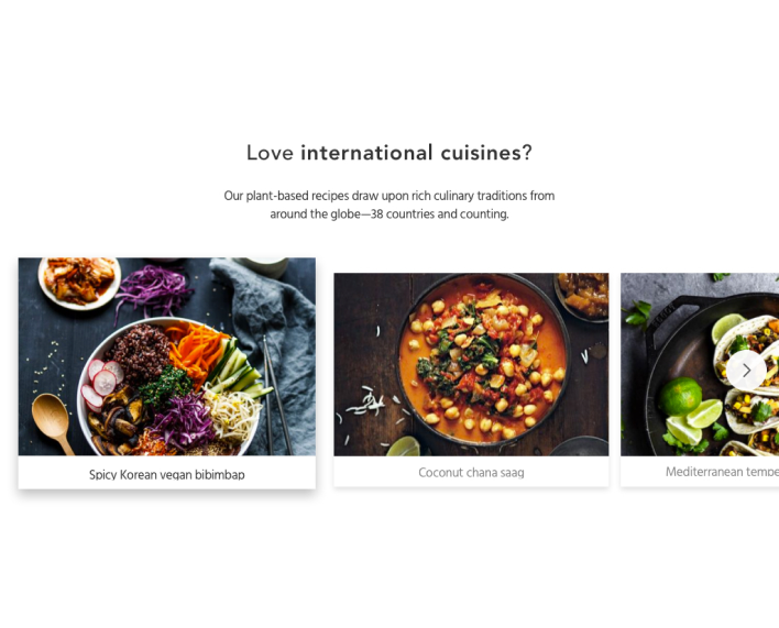
Personalized meal-planning tailored to the user's cuisine preferences and body characteristics.
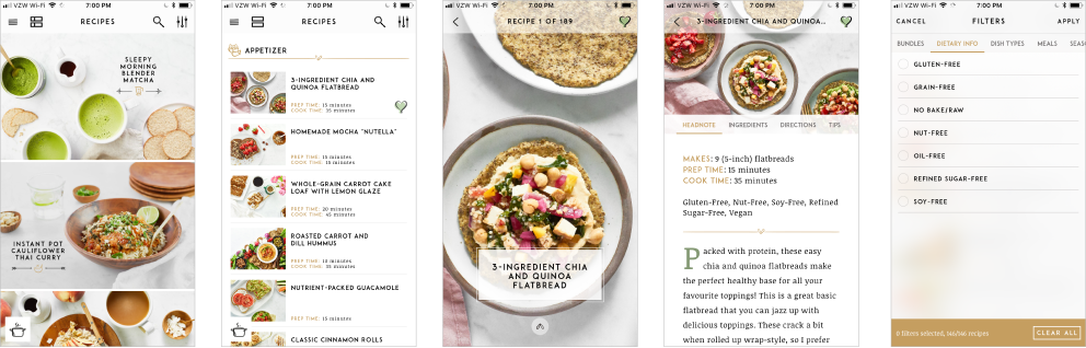
By answering a few questions to create a dietary profile, Ingrain will create daily serving recommendations of plant food groups for the user and suggest recipes that closely match the user's food preferences.
Value Proposition 2
Decrease the obstacles to meal-planning as much as possible.
Ingrain allows users to adjust serving sizes and quickly add ingredients to a grocery shopping list. It even flags allergens and food dislikes that the user specifies in their dietary profile.
Value Proposition 3
Offer a tool to track one’s progress
An interactive food tracker allow users to track their progress towards their recommended daily food servings, teaching the user to create balanced, plant-based meals appropriate to their body characteristics, so they can stave off hunger during their transition.
Learning from the competition
I examined how the four top players in the meal-planning space structure their product pages, among them are Pinto, Forks Over Knives (FoK), ChooseVeg, and 22 Days of Nutrition. Of the four, Pinto and Forks Over Knives had the most compelling landing pages.
Here is a comparison between Forks Over Knives and Pinto's page structures:


Comparison summary
Both FoK and Pinto have an almost 1:1 ratio of feature set to CTAs, both also concentrated the frequency of CTAs towards the beginning of the product page.
In terms of navigation, both opted not to have fixed nav-bars despite the length of the product page.
Structuring the product page
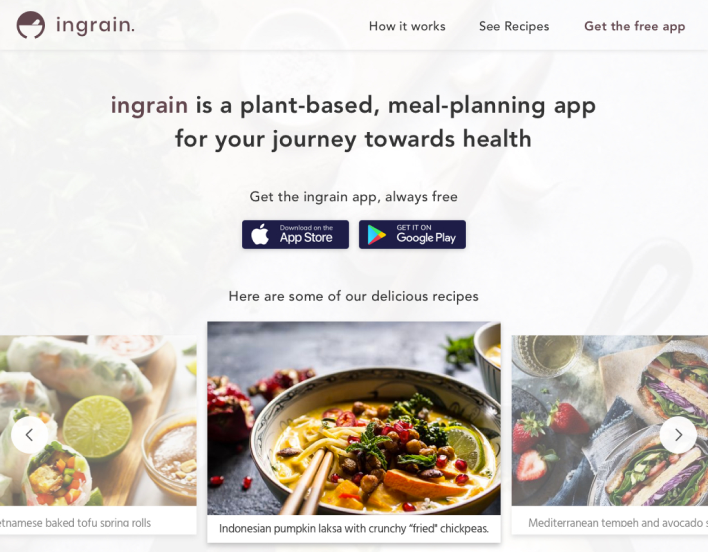
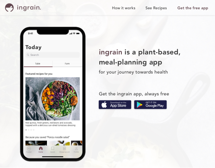
The initial page structure of Ingrain features an almost 1:1 ratio between feature set and CTAs. I opted to remove the recurring CTA of “get our free app” from the page-flow and unto the fixed top navigation bar. This allows me to reduce the number of CTA's throughout the entire product page—giving the featured recipe content all the room to take center stage.


Designing the skeletons of the page layout
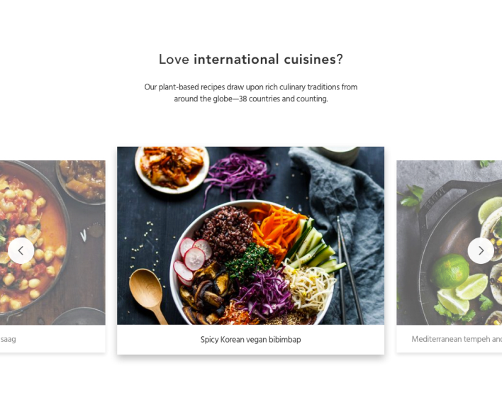
Ingrain’s product page comprises of four primary types of layouts: hero, product feature, social proof, and closing hero. Here are the variants considered within each layout type.
Hero variants


Feature layout variants


Social proof layout variants


Closing hero layout variants


Visual Design
The origin of the name
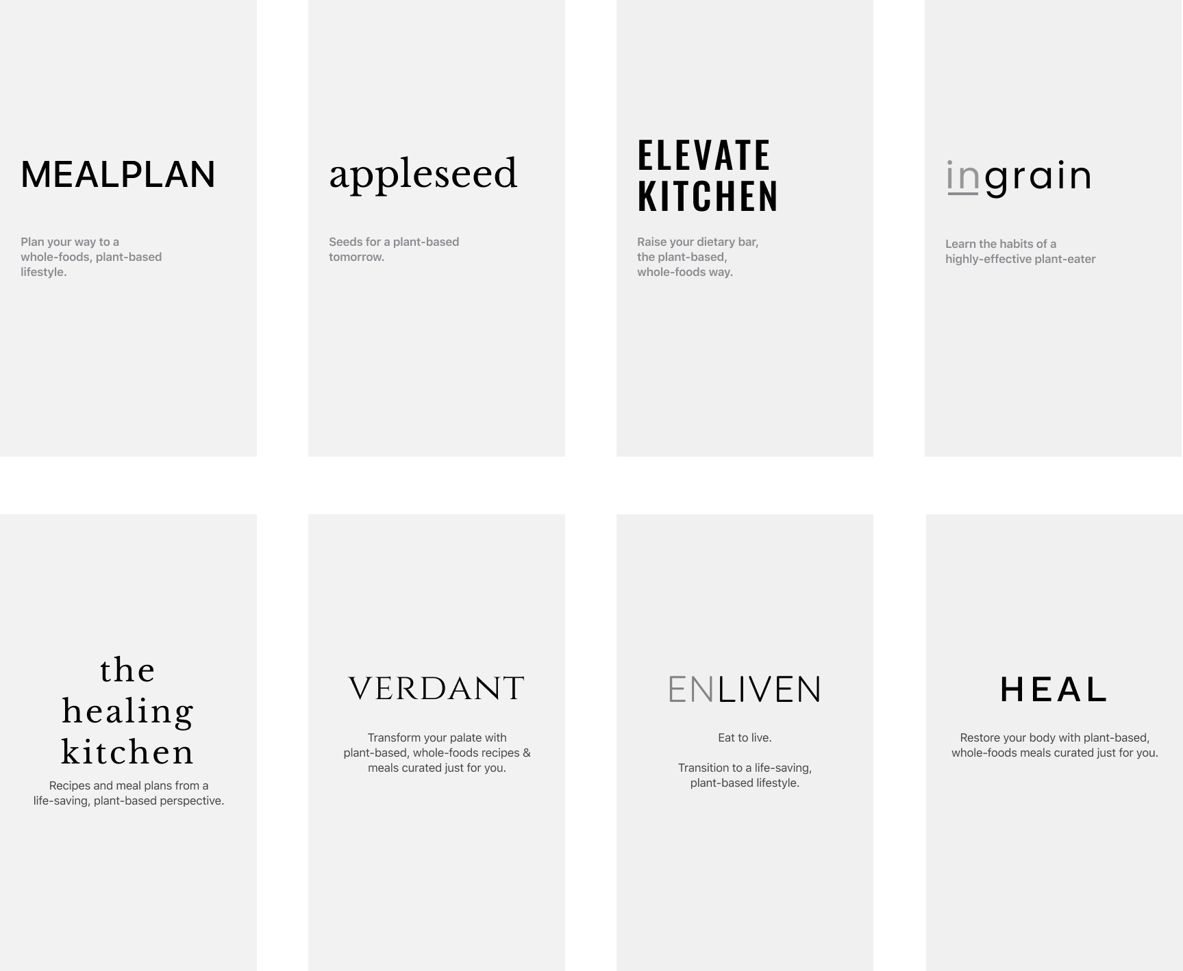
The name ‘ingrain’ is chosen because its multi-layered associations to plant-based eating. The word ingrain can be interpreted as ‘ingraining an eating habit in someone.’ It is also a play on the food group ‘grain,’ one of the four plant-based foods.
Here are a few of the other name alternatives considered:
Logo Design
The symbol of a mortar and pestle was chosen because it connects the idea of food with medicine. As one of the oldest food-preparation instruments used in cultures from around the globe, it is also used by apotecharies to crush medicinal herbs. From a branding standpoint, it stands out nicely against the logos of competitors that usually highlight familiar cooking or eating utensils.

Style Tile


Design iterations and preference tests
Hero image preference test
“Here are two options of the landing page hero for a meal-planning app. Which one does a better job in conveying what the app is about and encouraging you to engage with the content?”
67%
33%
Feature layout preference test
Here are two options of a carousel showing the content for a meal-planning app. Which one does a better job of encouraging you to explore?
100%
Putting the product page together
For the final high-fidelity mock-up of the responsive product page, I went with the minimized-CTA approach and alternated the product feature layout with social proof layout before closing with a strong combination of a user testimonial and the hero animation.